#11 “It’s Hard to Love Something That Has No Voice”: How FZS Helped Create the Protected Areas Brand Book
25 stories of memories for the 25th anniversary of the Frankfurt Zoological Society in Ukraine. We spoke with people who were there at the beginning of the organisation’s work in Ukraine and implemented its first projects together with FZS.
What do tree bark, an information board and the brand book of Ukraine’s protected areas have in common? Why can visual unity be important for helping people better understand and value protected areas? Khrystyna Mysak, Head of Communications and Tourism Development at FZS, recalls the creation of the protected areas brand, new websites and logos for national parks, and the development of an identity for protected areas.
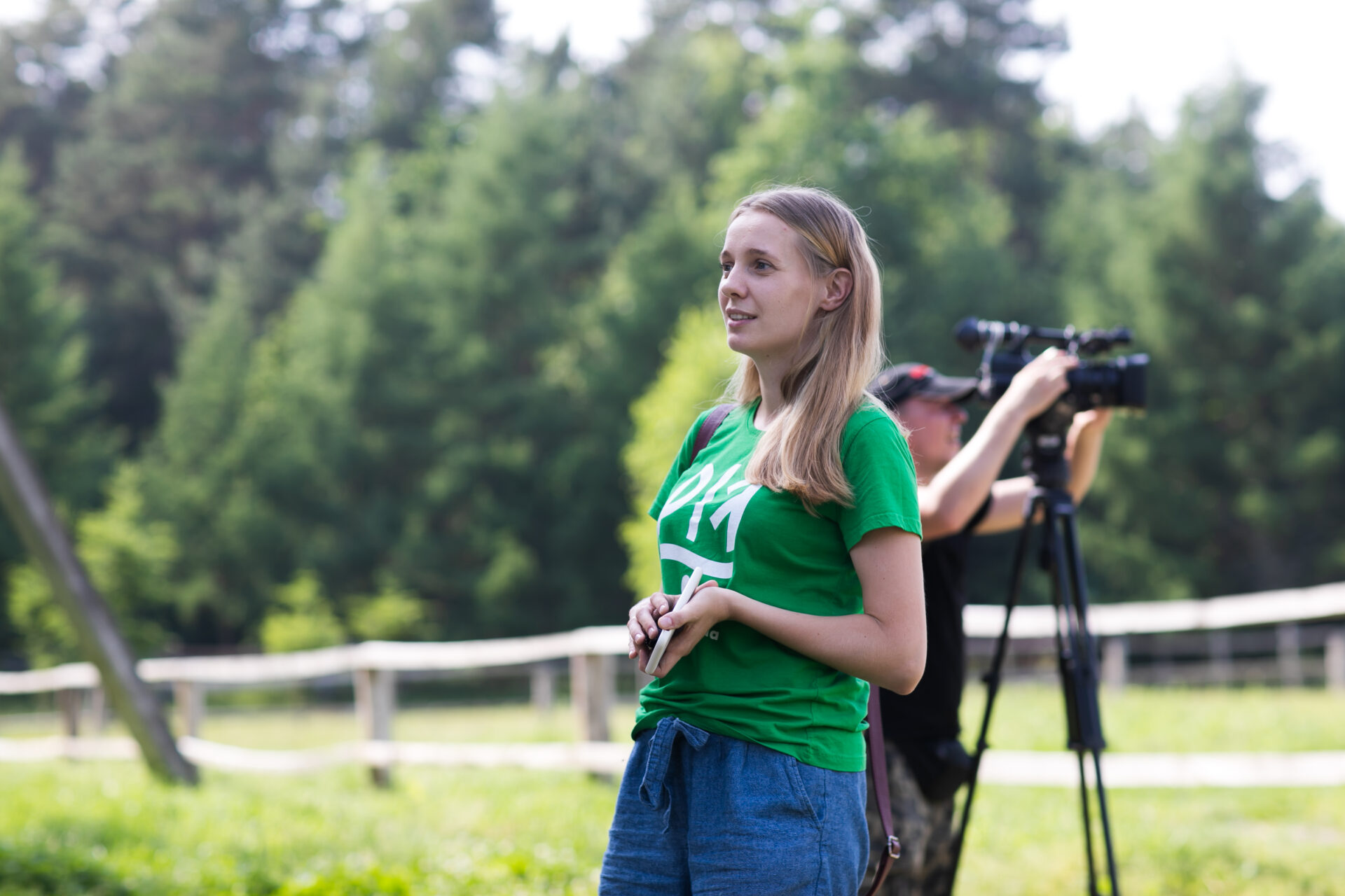
We began work on the protected areas brand book as part of the SNPA (Support to Nature Protected Areas in Ukraine) project in 2017.
At the same time, other procurements were under way and technical specifications were being developed to address many different challenges, but the brand book was one of the first steps. For Ukraine, this was rather unusual: when you start projects and immediately turn to developing a brand book while there are so many problems in the sector, it is natural to ask: is a brand book really the most important thing? But we eventually realised that it was a fundamental element, because in Ukraine, few people genuinely understand what protected areas are, what they are for and why they matter.
Clearly, there was a lot of work ahead to build this understanding. One important step was to make these areas recognisable: when people encounter them online, they should immediately understand that they are looking at a protected area, but they should also be able to navigate when they are there in person — to understand where they are within a protected area and where they are no longer in one. They should also be able to recognise which of the people they meet represent a protected area institution.
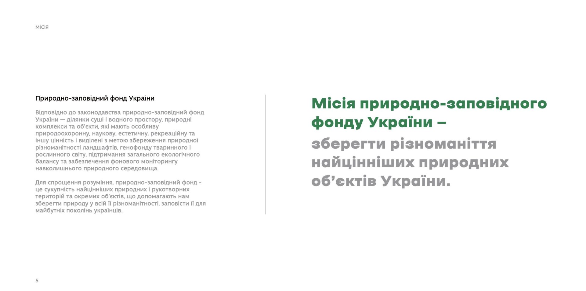
We began to explore the subject of protected areas more deeply: what kinds of territories there are, what their functions are and why they are important.
Together with the relevant ministry, we developed the technical specifications, and then the Happy Design team, which won the tender, began the truly enormous task of developing the brand book. Team members travelled to parks, talked to people and immersed themselves in the subject — it was not a matter of someone simply sitting down and drawing something. The development of the solutions took two years: there were creative explorations, discussions with various specialists and representatives of protected areas, as well as more routine work.
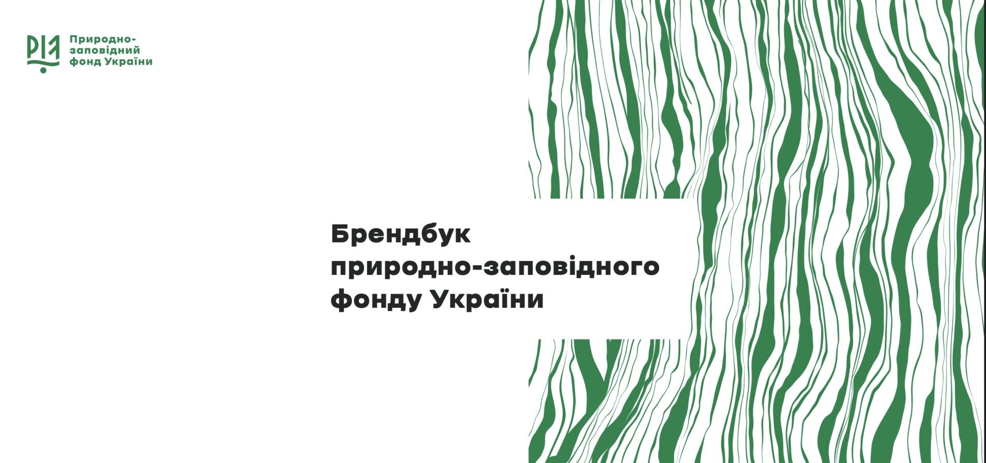
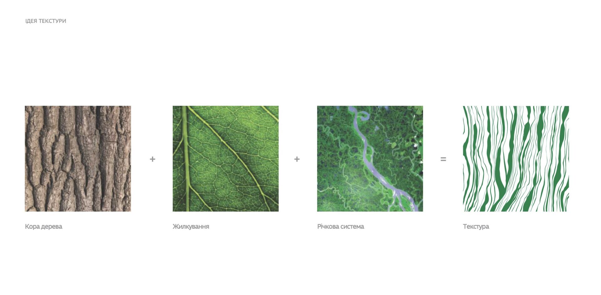
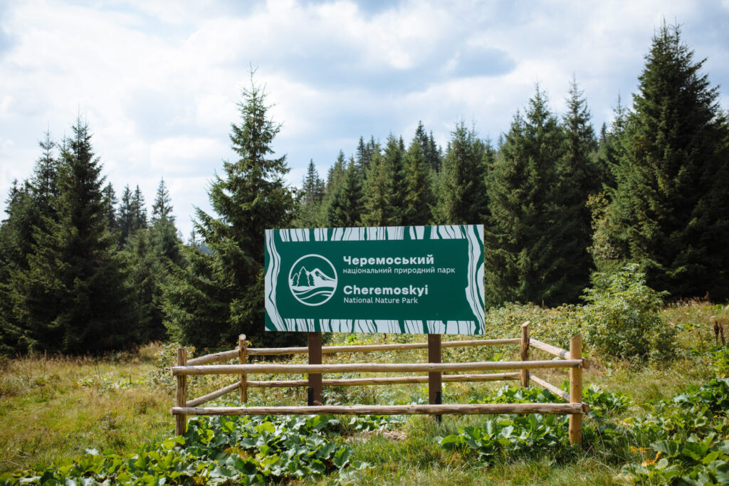
There was even a stage when they looked for different imprints of natural objects: leaves, parts of nature, animal tracks and so on. They looked at what kind of imprint each natural element left and whether it had a symbolic connection with protected areas. This is how one of the key elements of the brand book emerged — bark. One of its functions is to protect a tree. And protected areas are about protecting the most valuable parts of nature. So the lines we have in the main design texture are an imprint of bark. The symbolism is important here: a natural element became the basis of the visual solution, and that solution is connected to the core function of protected areas — protecting the most valuable parts of nature.

This brand book, and the protected areas’ visual identity as a whole, serves three functions.
The first is making the territories recognisable: a unified visual identity helps identify them as protected areas. The lines, colours, fonts and logo should all immediately signal that this is a protected area.
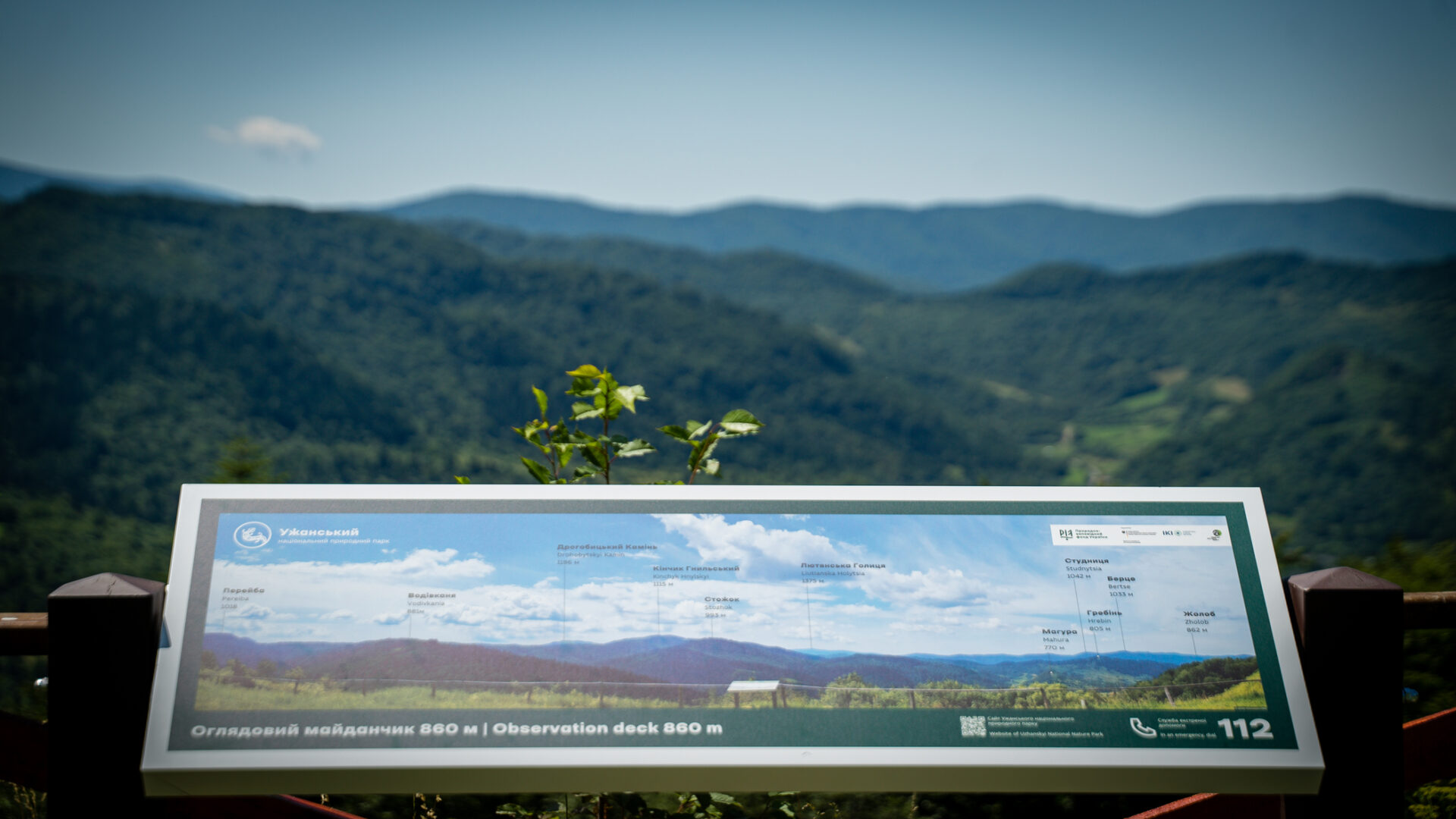
The second is helping tourists who are visiting these areas. People should understand: I am now in a protected area. Once a tourist is aware of this, they understand that there are certain rules to follow. They also will not get lost because they can follow the unified and thoughtfully designed signs, information boards and other forms of wayfinding. So this is not only about aesthetics, but also about navigation and visitor safety.
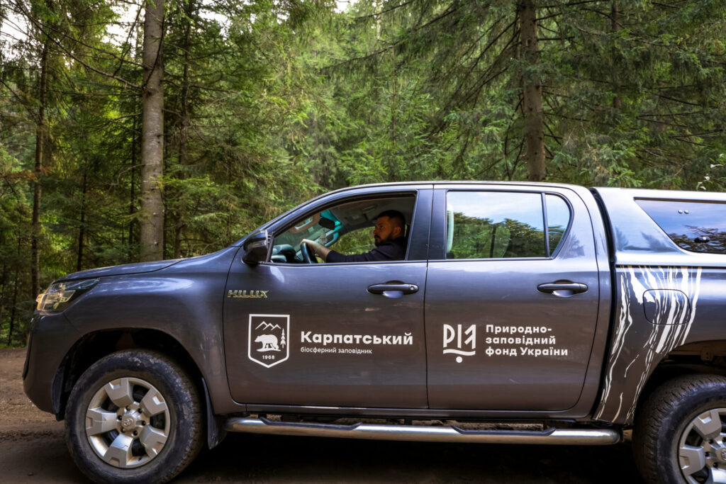
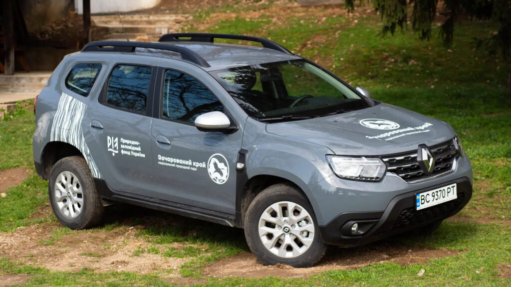
The third function, which is no less important, is to unify the work of everyone involved with protected areas. When a park employee needs to create any kind of design, they do not have to come up with a way to present each task from scratch: there are ready-made templates — a particular sign, an information board and so on. The same applies to organisations working with protected areas: for example, when we provide parks with vehicles, we already know what they should look like.
We created the brand book for more than 8,000 protected areas.
Overall, our work under SNPA focused on eight Carpathian national parks and nature reserves. But when we began working on their visibility, we realised that there was no point in creating a separate solution only for these territories. What was needed was a unified approach that could be used by all protected areas and sites in Ukraine — and there are more than 8,000 of them. Before that, there was no comprehensive solution for all protected areas: there were only individual recommendations for how signs, information boards, boundary markers and so on should look. So we developed this solution. Over the following ten years, we continued to expand the set of communication and promotional tools that parks use today: websites, social media materials, information signage and more.
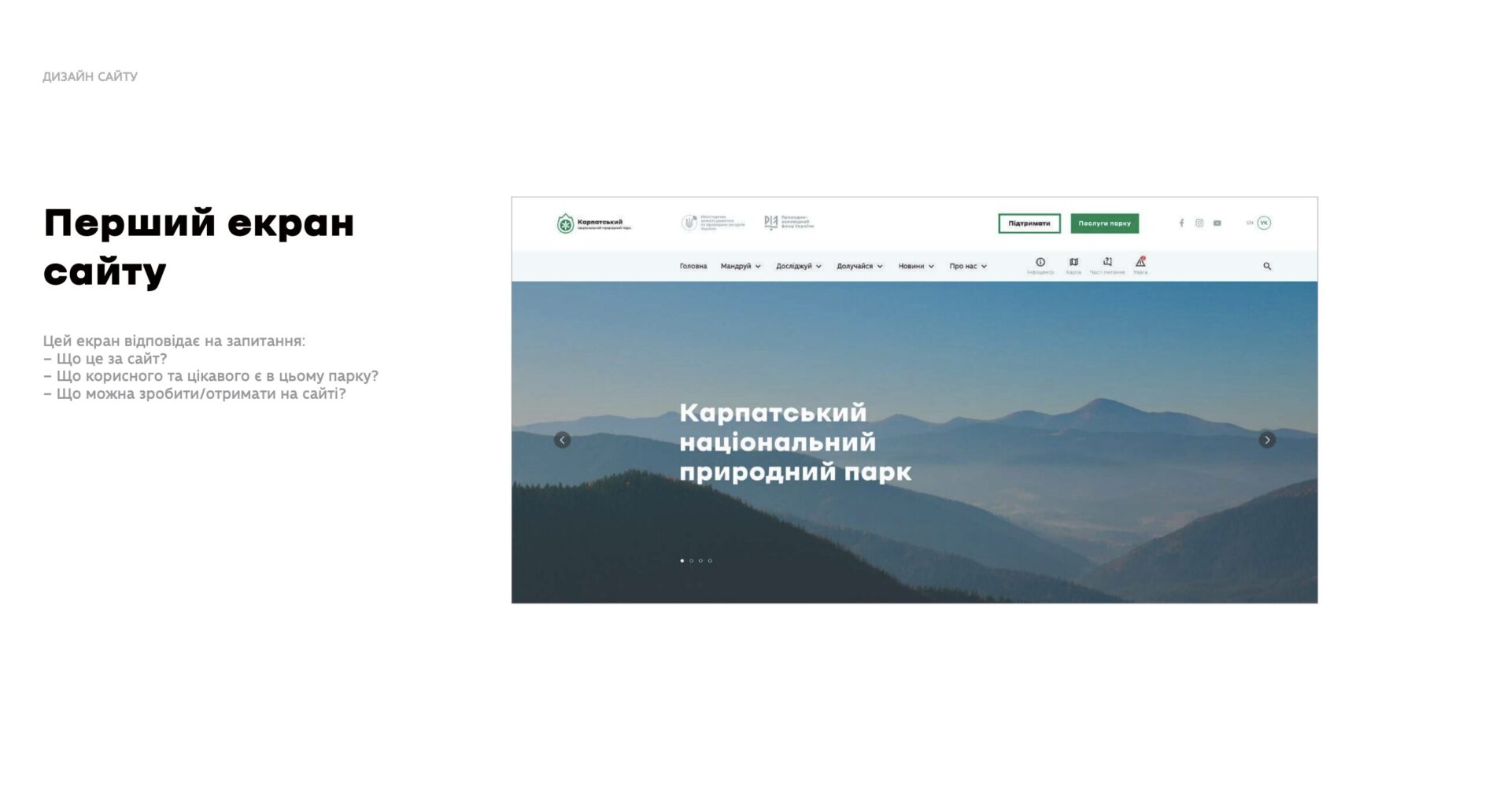
Websites for protected areas are another major part of the project.
Their first websites were often hosted on free platforms with a lot of advertising and pop-up windows, without any clear structure or a pleasant user experience. Our goal was to create a website that would serve as a kind of introductory calling card, while also meeting the audience’s basic information needs. It was also important to create a template that other institutions could use, because this matters in conditions of insufficient funding.
The main audience is travellers, because they are the ones who need the most practical information: where and when to go, how to get there, what routes are available, what to see, what to do and so on. But, of course, the website should also contain information for researchers, local residents and partners. So when developing the standardised structure, we took the needs of different website visitors into account. We also wanted to attract people who are simply interested in nature. That is why we created an “Explore” section, where visitors can discover the flora and fauna of a particular national park or nature reserve.
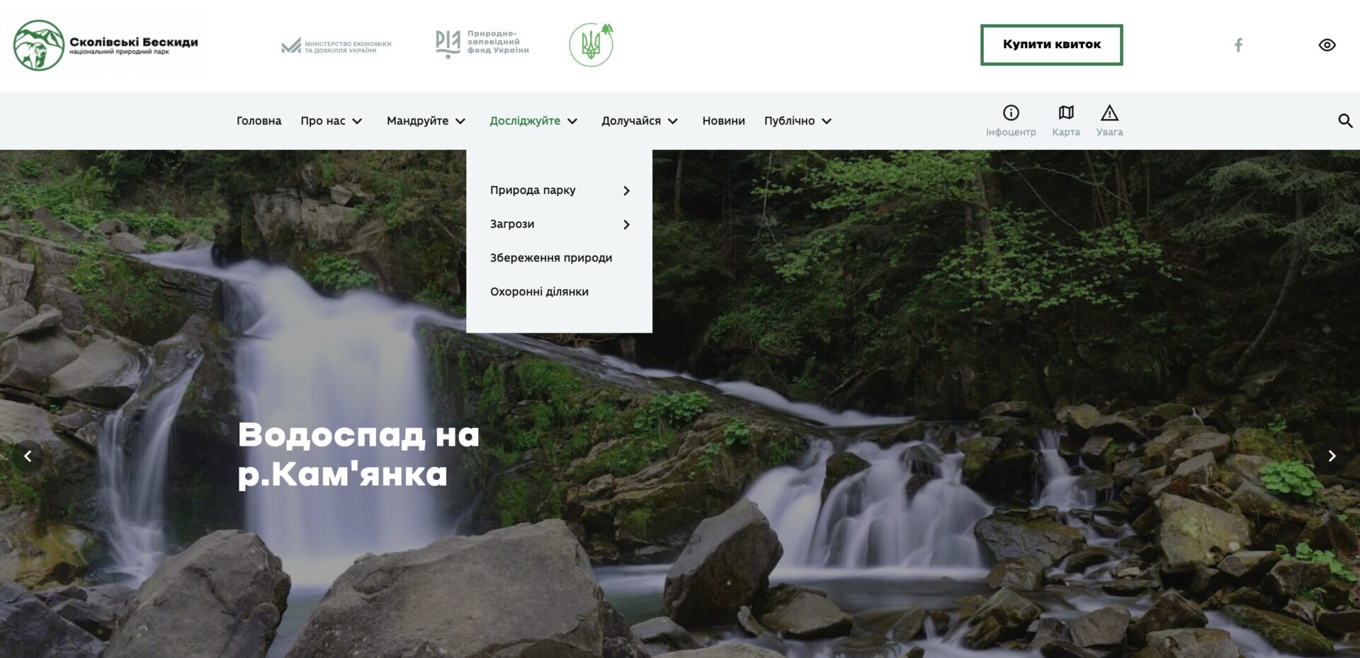
The most important thing is that for almost 10 years now, we have been systematically supporting the hosting, domains and improvement of the websites of the institutions we work with directly. It may seem like a small thing, but it is important not simply to complete the work and leave national parks on their own with their websites, but also to ensure their regular maintenance and improvement.

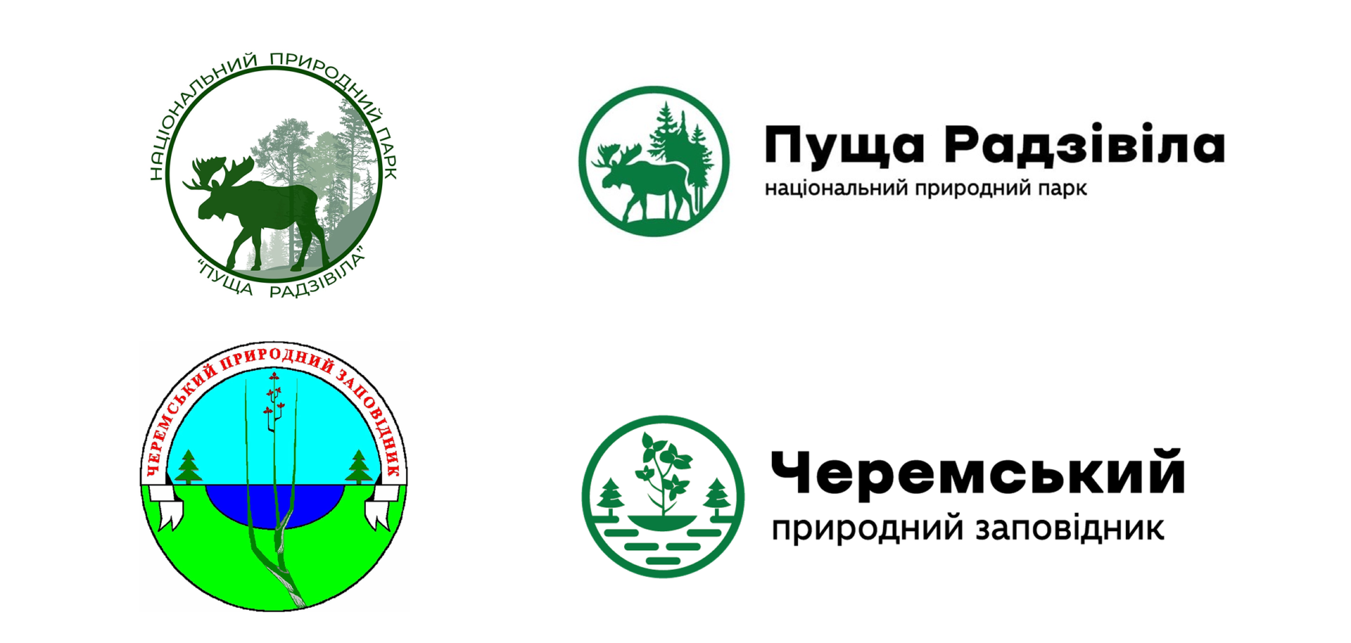
Another important part of the work is logos.
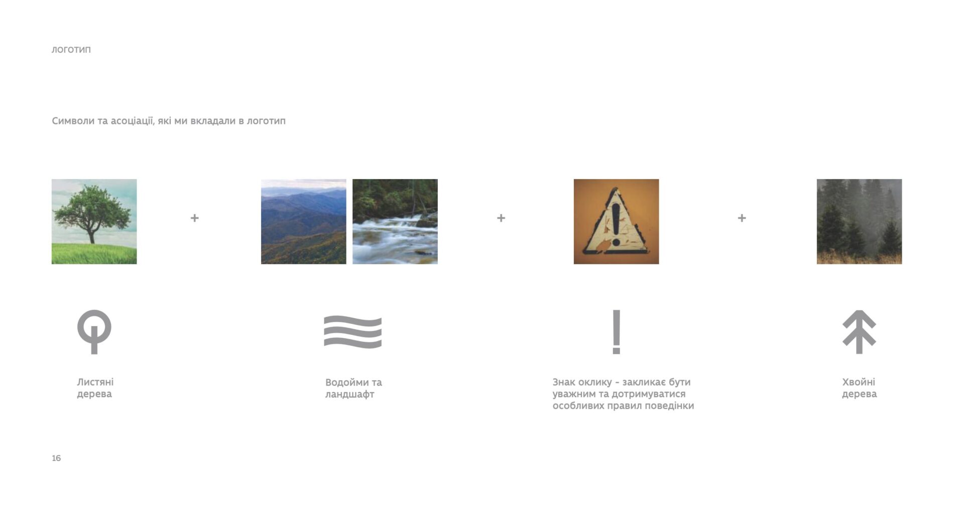
It was a long process of updating them — not without resistance from protected areas. This was understandable: when an entire park team had worked on a previous logo and created it through their own efforts, it is very difficult to change something they had put their heart into and grown accustomed to. So we tried to preserve the foundation of the logos and simply turn them into a more visually clear and unified style. At the same time, we developed a solution that would allow any protected area institution wishing to unify its logo to understand which set of elements and colours to use and how to incorporate them into its own logo.
Today, the brand book is used in different parks for a wide range of purposes
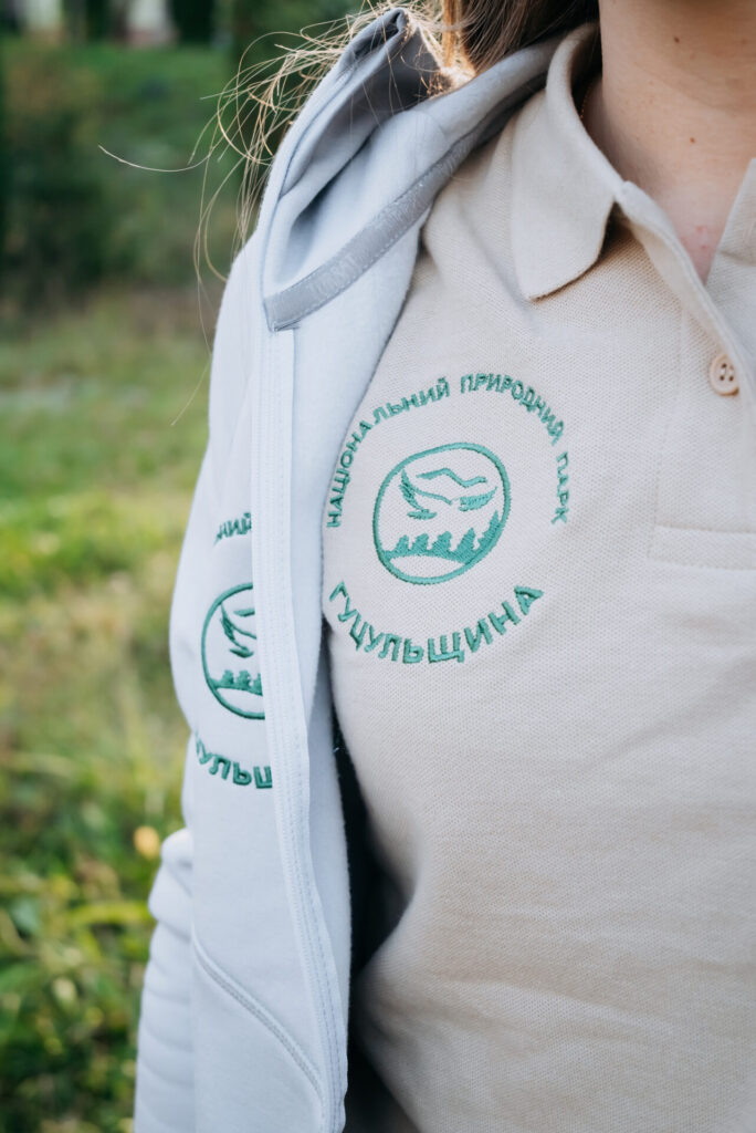
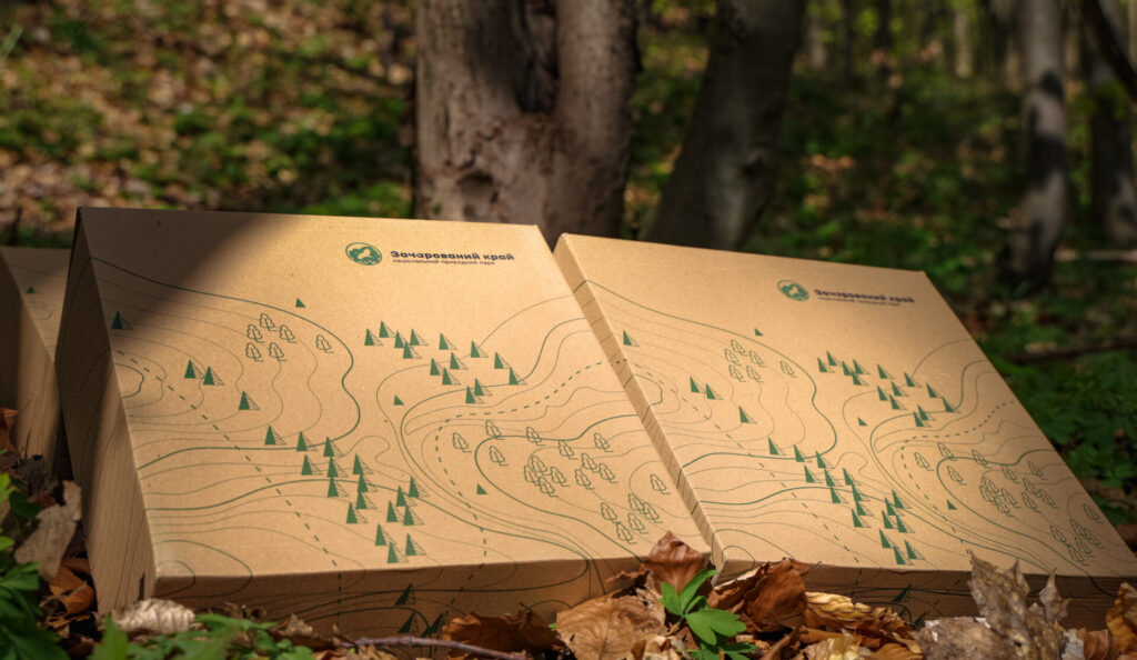
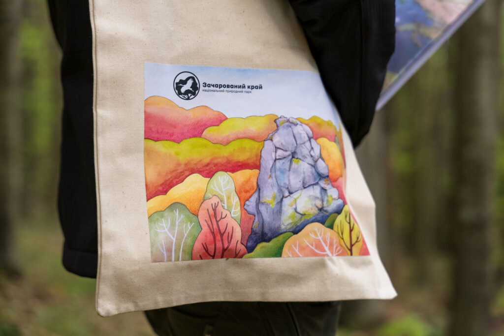
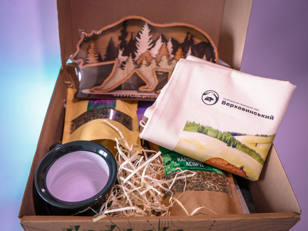
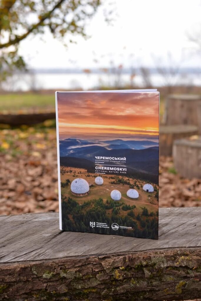
— from designing notebooks and tote bags to branding vehicles and motorcycles. It has also been used for branding bedding and towels, Polissia honey and the e-ticketing system for protected areas. It is especially valuable to see how all these very different things come together into one recognisable visual system. This consistency helps create a coherent image of Ukraine’s protected areas.
Ten years have now passed, and we can see that the brand book will eventually need to be updated.
But at the same time, we have not yet fully realised its potential: active changes have only just begun, and only now are we starting to see them in the physical environment. When you visit national parks and nature reserves, you finally understand that you are on the territory of a particular institution: you see signs and wayfinding, and everything is unified, looks attractive and aesthetically coherent, and does not create visual noise in the middle of nature. So the brand book is fulfilling its function, but yes, at some point it will be worth modernising, and we are ready for that.
This is the eleventh story for the 25th anniversary of FZS in Ukraine. You can find the first stories at the links below:
#1 Prypiat, Goldeneye ducks, and Fish Weirs — How FZS’s Work Began in Ukraine.
#3 Explore all of mountainous Crimea: the project that introduced Ukraine’s vultures to Europe
#5 A Shift Toward the Carpathians: Why FZS Suspended Its Work in Polissia in 2013
#6 Pickups, Uniforms and Management Plans: How Two German Projects Transformed 13 Parks
#7 How Carpathian National Parks Were Expanded by 40,000 Hectares
#9 Vehicles, Motorcycles and Uniforms: FZS’s Experience in Strengthening the Work of National Parks